Building an Accessible Typeahead Component with React
February 09, 2024 | 10 minutesIn This Post
Link to the full code example
Typeahead fields are pretty common on the web. We find them everywhere from Google search to Uber Eats. They're so common, in fact, that they're a popular interview topic for front-end system design discussions. One aspect of creating a typeahead component that could use more attention is accessibility.
The general HTML structure for a typeahead component includes an input element, a div that contains a list of suggested values, and a label to describe the input.
1const Typeahead = () => {
2 return (
3 <>
4 <label htmlFor="search-box">Search for a color:</search>
5 <input id="search-box" type="search" />
6 <div>
7 <ul>
8 <li>Suggestion</li>
9 </ul>
10 </div>
11 </>
12 )
13}
Providing a label element and associating it with the input lets assistive technologies know that the two elements are related and provides context about what the input is meant to be used for. It's only one step toward making an accessible component, though. Let's dig into the details of how to build a typeahead component that handles keyboard interactions and can be used via screen readers and other assistive technologies.
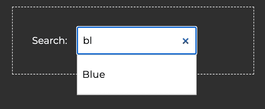
Here's an example of an accessible typeahead component that we'll refer to throughout this post. Start typing a color name, like blue or green, to see it in action or check it out on CodePen.
How Does a Screen Reader Know the Suggestion Box is Related to the Input? ARIA Roles
Visually, we can tell that the suggestion box is related to the input due to their proximity to each other. Right now, there's nothing in the code that indicates these two elements are related, though. This means that screen readers won't properly announce the suggestions.
Screen readers and other assistive technology rely on ARIA roles and attributes to know when there's a relationship between elements. There are several ARIA roles that we need to set on the elements within our typeahead component to make the relationships between them clear beyond just through visual means:
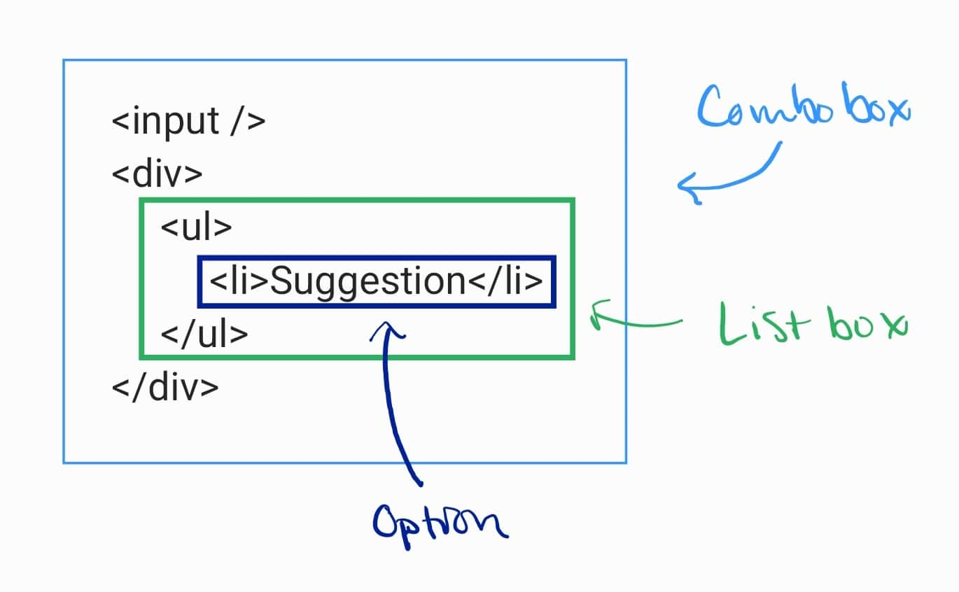
- Combobox: In the case of our typeahead component, the collection of HTML elements forms something called a combobox. Simply put, a combobox is an ARIA role that identifies an
inputelement that controls another element, like a list that dynamically appears to help users enter a value in the input. So, we need to addrole="combobox"to theinputelement to make it clear that the input will control another element. - Listbox: The element that the combobox will control for our typeahead component is an unordered list of suggested values. That list is considered a listbox under the available ARIA roles, which indicates that it contains a list of items and users can select one or more of those items. We need to add
role="listbox"to the unordered list element. - Option: Options within a listbox indicate the selectable items. To let assistive tech know that the list items within the listbox are selectable, we need to add
role="option"to them.
Here's a simplified example of what the code should look like:
1<input id="search-box" type="search" role="combobox" /> 2<div> 3 <ul role="listbox"> 4 <li role="option">Suggestion</li> 5 </ul> 6</div>
Additional ARIA Attributes Needed for Comboboxes
When using the combobox role, you're also required to set the aria-expanded property on the controlling element (aka, the input). This should be set to true or false based on whether the suggestion box is open.
1<input 2 id="search-box" 3 type="search" 4 role="combobox" 5 aria-expanded="CONDITIONAL IF THERE ARE RESULTS" 6/>
In addition to aria-expanded, we'll also need to set the following ARIA attributes based on the setup of our typeahead component. These aren't required for all comboboxes, but are relevant and necessary for our typeahead component.
aria-haspopuparia-controlsaria-autocompletearia-activedescendant
Let's look at these in a little more detail to understand what they're doing.
aria-haspopup
The aria-haspopup attribute lets assistive technology know that a popup is available related to the input and indicates how users can interact with the popup. This is necessary any time the combobox is related to an element with role="listbox", as in our typeahead component. The value should match the role of the popup element, so for our component, we'll add aria-haspopup="listbox" to the input element.
1<input 2 id="search-box" 3 type="search" 4 role="combobox" 5 aria-expanded="CONDITIONAL IF THERE ARE RESULTS" 6 aria-haspopup="listbox" 7/> 8<div> 9 <ul 10 role="listbox" 11 > 12 <li role="option">Suggestion</li> 13 </ul> 14</div>
aria-controls
With the aria-haspopup attribute, we're telling assistive tech that a popup exists and is connected to this element. With aria-controls, we're telling it which element is the popup. The value should be the id of the element used for the popup, which is the suggestion box in our case. We'll use suggestion-box for the id.
1<input 2 id="search-box" 3 type="search" 4 role="combobox" 5 aria-expanded="CONDITIONAL IF THERE ARE RESULTS" 6 aria-haspopup="listbox" 7 aria-controls="suggestion-box" 8/> 9<div> 10 <ul 11 role="listbox" 12 id="suggestion-box" 13 > 14 <li role="option">Suggestion</li> 15 </ul> 16</div>
aria-autocomplete
By using aria-autocomplete, we let assistive technologies know that entering text in the input will trigger the display of suggestions the user might be looking for. There are three modes for this: inline, which describes showing just one suggestion; list, which describes showing a list of suggestions in a separate element that popups up near the input; and both, which describes using both an inline suggestion in the input and a list of additional suggestions. For our component, we're just going to show a list of suggestions below the input, so we'll set aria-autocomplete="list" on the input.
1<input 2 id="search-box" 3 type="search" 4 role="combobox" 5 aria-expanded="CONDITIONAL IF THERE ARE RESULTS" 6 aria-haspopup="listbox" 7 aria-controls="suggestion-box" 8 aria-autocomplete="list" 9/> 10<div> 11 <ul 12 role="listbox" 13 id="suggestion-box" 14 > 15 <li role="option">Suggestion</li> 16 </ul> 17</div>
Note that this attribute doesn't actually implement any functionality; instead, it describes the intended behavior so that screen readers and other tools know how to present the elements to users.
aria-activedescendant
The aria-activedescendant attribute is the most interesting attribute we'll use. It allows you to identify a child element as having focus even though the actual browser focus is still on its parent.
Let's think for a minute about how we want keyboard users to be able to use our typeahead component. They should be able to:
- Tab to the input, which will set focus to it.
- Start to type their search term.
- See the correct suggestion in the suggestion box and use the arrow keys to change the focus to the correct suggestion.
- Press Enter or Tab to select the suggestion, which should replace the text in the input.
This seems pretty straightforward except for one thing: how can we support letting users move from the input element, which has focus in the browser, to the items in the suggestion box? Our component contains multiple focusable children (aka, descendants), so we need a way to manage that.
The ARIA-recommended approach is to set aria-activedescendant on the combobox element and use JavaScript to dynamically set its value to a unique ID for the active child element in the listbox.
1import { useState, useRef } from 'react';
2
3const sampleData = ["Blue", "Green", "Purple", "Yellow", "Red", "Orange"];
4
5const Typeahead = () => {
6 const [suggestions, setSuggestions] = useState(sampleData);
7 const [currentIndex, setCurrentIndex] = useState(-1);
8
9 const inputRef = useRef(null);
10
11 const updateActiveDescendant = () => {
12 if (
13 currentIndex >= 0 &&
14 currentIndex < suggestions.length
15 ) {
16 // Sets the aria-activedescendant attribute to the current index,
17 // which represents a child in the listbox
18 inputRef.current.setAttribute("aria-activedescendant", currentIndex);
19 }
20 };
21
22 const handleKeyDown = (event) => {
23 // Based on the arrow key pressed, update the index of the active child
24 // and then update the aria-activedescendant value
25 if (event.key === "ArrowDown") {
26 if (currentIndex < suggestions.length - 1) {
27 setCurrentIndex(currentIndex + 1);
28 updateActiveDescendant();
29 }
30 } else if (event.key === "ArrowUp") {
31 if (currentIndex > 0) {
32 setCurrentIndex(currentIndex - 1);
33 updateActiveDescendant();
34 }
35 }
36 };
37
38 return (
39 <>
40 <input
41 id="search-box"
42 ref={inputRef}
43 type="search"
44 role="combobox"
45 aria-haspopup="listbox"
46 aria-controls="suggestion-box"
47 aria-autocomplete="list"
48 aria-expanded={suggestions.length > 0}
49 onKeyDown={handleKeyDown}
50 />
51 <div>
52 <ul
53 role="listbox"
54 id="suggestion-box"
55 >
56 {suggestions.map((suggestion, index) => {
57 return (
58 <li role="option" id={index}>{suggestion}</li>
59 )
60 })}
61 </ul>
62 </div>
63 </>
64 )
65};
It's important to note that using aria-activedescendant only informs assistive technologies about the focused option in the listbox; it doesn't change anything visually in the UI. To visually update the UI as a user navigates between options, we can use the same unique ID we're setting for aria-activedescendant to apply a CSS class that can change the active option's background color on focus. We can also apply the background color on hover for mouse users.
1/* CSS */ 2.focused, .typeaheadResults ul li:hover { 3 background-color: #bde4ff; 4}
1// JS
2import { useState, useRef } from 'react';
3
4const sampleData = ["Blue", "Green", "Purple", "Yellow", "Red", "Orange"];
5
6const Typeahead = () => {
7 const [suggestions, setSuggestions] = useState(sampleData);
8 const [currentIndex, setCurrentIndex] = useState(-1);
9
10 const inputRef = useRef(null);
11
12 const updateActiveDescendant = (index) => {
13 if (
14 index >= 0 &&
15 index < suggestions.length
16 ) {
17 inputRef.current.setAttribute("aria-activedescendant", index);
18 }
19 };
20
21 const handleKeyDown = (event) => {
22 if (event.key === "ArrowDown") {
23 if (currentIndex < suggestions.length - 1) {
24 const newIndex = currentIndex + 1;
25 setCurrentIndex(newIndex);
26 updateActiveDescendant(newIndex);
27 }
28 } else if (event.key === "ArrowUp") {
29 if (currentIndex > 0) {
30 const newIndex = currentIndex - 1;
31 setCurrentIndex(newIndex);
32 updateActiveDescendant(newIndex);
33 }
34 }
35 };
36
37 return (
38 <>
39 <input
40 id="search-box"
41 ref={inputRef}
42 type="search"
43 role="combobox"
44 aria-haspopup="listbox"
45 aria-controls="suggestion-box"
46 aria-autocomplete="list"
47 aria-expanded={suggestions.length > 0}
48 onKeyDown={handleKeyDown}
49 />
50 <div>
51 <ul
52 role="listbox"
53 id="suggestion-box"
54 >
55 {suggestions.map((suggestion, index) => {
56 return (
57 <li
58 role="option"
59 id={index}
60 className={
61 // Sets focused class only when item is
62 // the active descendant
63 index === currentIndex ? 'focused' : undefined
64 }
65 >
66 {suggestion}
67 </li>
68 )
69 })}
70 </ul>
71 </div>
72 </>
73 )
74};
Additional ARIA Attributes for the Option Role
All selectable options also need the aria-selected attribute, which indicates whether or not an option is currently selected. Continuing with the example from above, we can set the aria-selected attribute to true if the index of the option matches the currentIndex value (i.e., if the option is the active descendant).
1<div> 2 <ul 3 role="listbox" 4 id="suggestion-box" 5 > 6 {suggestions.map((suggestion, index) => { 7 return ( 8 <li 9 role="option" 10 id={index} 11 aria-selected={index === currentIndex} 12 > 13 Suggestion 14 </li> 15 ) 16 })} 17 </ul> 18</div>
Using the Typeahead with VoiceOver
Here's an example of using the typeahead component with a keyboard and VoiceOver in Chrome on a Mac. Turn the sound on to hear how VoiceOver announces the focused elements.
Full Implementation for Accessible Typeahead
Here's all of the code for an accessible typeahead as tested on desktop in Chrome, Safari, and Firefox, and on mobile in Chrome for Android and Safari on iOS. It includes additional logic for handling pressing Enter, Tab, and Escape within the input; filtering the sample data after debouncing key up events; and closing the suggestion box when you click outside of it.